- Apr 18, 2017
 0
0- by A2 Marketing Team
Image Credit: MatteoZanga.it
Opposing forces blend in interesting ways. Black and white together make infinite shades of grey. Light meets dark during inspiring sunrises and gorgeous sunsets. Just the same, a number of disparate visual elements can be stood side by side to create thought provoking and attention grabbing examples of contrast.
There are 4 major types of contrast in web design:
- Light and dark
- Color
- Foreground and background
- Size and shape
These equal and opposing forces can be utilized to create a number of distinct impressions that will leave users intrigued and engaged. Contrast is used to emphasize, illuminate, embellish, intimate, and in many cases: to tease out meaning. It takes a steady hand and an expert eye to wield contrast to its full potential, but it all starts with recognizing which types of contrast can be used for what reasons.
That’s what we’ll be discussing today. The primary ways in which contrast can be implemented and the primary effects each implementation has on the viewer.
You Don’t Know the Power of the Dark Side!
The first type of contrast we’ll be discussing is between light and dark. It’s also the most common usage, and therefore the one people are most familiar with. There are two primary uses for light and dark contrast:
- Accent– you can create an impression of depth by making certain elements darker, i.e. buttons, switches, etc.
- Emphasis– by increasing the brightness next to a darker element, you can guide a user’s attention toward the light.
This can be very helpful when you have a Flat site that you want to give a little bit of depth. Long shadows are a great example of light/dark contrast in action.

Notice how the longer shadow of the origami bird on the right puts the geometric quality of it into focus. You can also observe how the shadows of the Adobe and Calendar icons in the image at the bottom give the impression that the graphic is three dimensional. Finally, the darker shade of grey at the top of the page contrasts with the white below, encouraging a user to scroll downward to view the rest of the page’s content.
It’s simple yet effective usage of light and dark contrast which allows the graphical elements on the page to stand out while gently nudging the user’s attention in the direction that the designer wants them to go in order to continue engaging with the design.
All the Colors of the Rainbow
The next type of contrast we should discuss is color. The primary purpose of color contrast is, again, to guide user attention. However, it’s secondary and tertiary purposes are far more versatile than those of light and dark. Color has some well-documented effects on human psychology, and the use of contrasting color schemes can also be a major differentiator in the way your design is perceived.
For the most part, color contrast is discussed in (unsurprisingly) two categories:
- Warm Colors– sunshiney hues like reds, yellows, and oranges.
- Cold Colors– frosty and aquatic tints like blues, greens, and purples.
These can also be discussed in terms of passivity and aggression. In essence, warm colors supersede cool ones. That means the relaxing blues or greens of a webpage can be overlaid with a hot pink or orange-ish colors and your attention is bound to be focused on the elements radiating the most heat.
This is why CTAs are invariably colored red, and are even more effective when placed upon a cool colored background. Wherever the color scheme heats up, that’s where the attention naturally flows to, and consequently, where most of the user engagement occurs.
Bring Your Attention to the Fore
Next up on our list is the difference between the foreground and the background. This addresses, once more, issues of depth and focus. The foreground contains the items and elements most important to a user and clearly establishes their place in the visual hierarchy. While the background serves as a pedestal upon which the foreground elements are placed. A setting which is used to emphasize the important stuff.
This can be exciting because you get into all sorts of opportunities for animation with this type of contrast. Parallax scrolling is a particularly tasty bit of background/foreground contrast because the background moves out of synch in relation to the foreground as the user scrolls. This creates depth, adds visual delight, and enhances user experience overall.
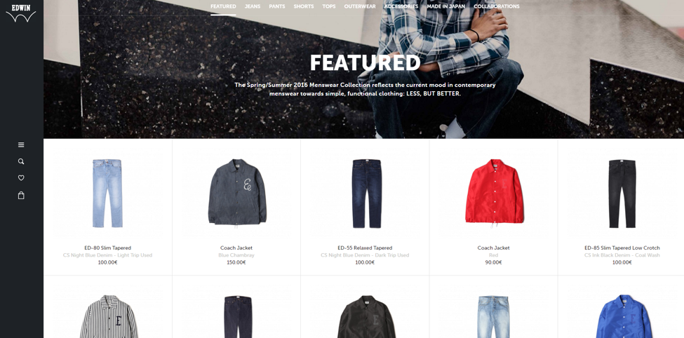
You can click through to the website above to get a concrete example of parallax in action. Note how the imagery in the background serves to complement the product images in the fore. Note again, how the color scheme used in the back is mostly passive, while there’s a single warm element drawing attention in the front. This is a clever example of two different types of contrast in action.
Size Matters
The next type of contrast we have to discuss is that which exists between sizes. This is really self-explanatory stuff here, but for the sake of clarity:
- Bigger means more important
All contrast is used in some form or another to direct user attention. Size does it by letting the human eye know that something is larger, and therefore of more immediate concern.
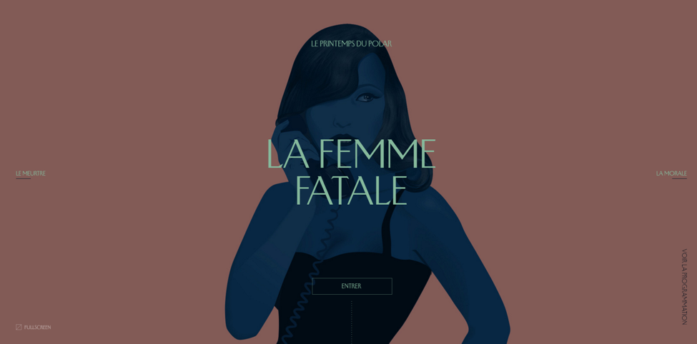
Here we see a gigantic background image. This supplements the intriguing typography in the foreground. The size of the illustration lets the user know the magnitude of the situation, while the typography in the fore, insinuates the story set to unfold, while the navigation controls sit small and inconspicuous, yet still clearly visible off to the sides or lower on the screen. This achieves the desired effect of allowing the user to become emotionally effected by the imagery and connotation of the verbiage while still allowing them to navigate as soon as they’re ready.
I Am in Shape… I’m Round
Shape accomplishes the same direction of attention by taking advantage of the human tendency toward pattern recognition. When you see 3 squares and find a circle, you know instinctively that the circle bares closer scrutiny. For an example of contrast in shape, let’s take a look at some geometrically inspired work:
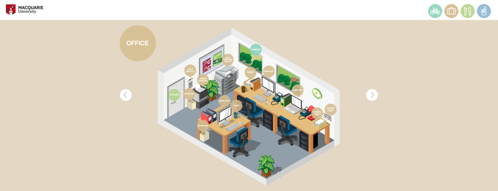
This integrated image on the Macquarie university website, differentiates between inauspicious illustration and interactive element with the contrast between squares and circles. Circular elements are clickable and illuminate content, while the square geometry of the image connotes its static nature.
Contrast is an essential design tool and often the go to method for determining a designer’s competency. It’s key to producing visually delightful work that also accomplishes the primary purpose of directing user attention. If you can grasp this concept and put it to effective use in your work, then you’re well on your way to producing a usable and beautiful website.
Using design contrast uniquely in your business? Sound off in the comments.
Kyle Sanders is Head of Search at CWR SEO, an Austin-based design and marketing agency. Check out their design portfolio or connect with him directly on Twitter.
