- Dec 17, 2019
 0
0- by A2 Marketing Team
Browsing the web should be a painless process. You access a website, go from page to page, find what you want, and move on. The problem is that not everyone can navigate sites with the same level of ease. To help them have a good experience, you need to design your website with accessibility in mind.
Increased accessibility means that people with mental and/or physical challenges should still be able to navigate your website and use its various features. This involves a bit of extra work, but in return, you’ll get a broader audience and not have to worry about alienating some of your visitors.
In this article, we’ll talk a bit more about what web accessibility is and why it’s so critical. Then we’ll go over three quick tips to ensure that your website is as accessible as possible. Let’s get to work!
What Is Website Accessibility (And Why Is It Important)?
The more accessible your website is, the easier it becomes for more people to use it. That applies even to users with disabilities, who may not be able to interact with the web in the same way that other people do.
Consider visual impairments, for example. If you have a difficult time reading small print, navigating a text-heavy website becomes quite a challenge. That’s one of the reasons most browsers ship with zooming functionality out of the box:
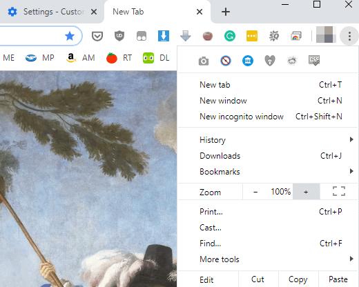
A zooming feature enables you to resize text on the fly, so you can still enjoy the content. That makes it a perfect example of an accessibility feature.
For website owners, a high degree of accessibility means you’re not leaving behind any potential audiences. By increasing accessibility, you make your website more comfortable to use by everyone, which is a net positive for both them and you.
Moreover, in some countries, you are required by law to ensure that your website is accessible for users with disabilities. In the past years, there’s been a massive surge in web accessibility lawsuits. That means being proactive when it comes to accessibility isn’t only user-friendly, but can protect you against litigation.
If you want to gauge your website’s current level of accessibility, there are a couple of tools we recommend checking out. The A11Y Project goes over several key accessibility features you can test for, and DYNO Mapper offers you a report of how user-friendly your website is.
If your website doesn’t score well when it comes to accessibility, don’t worry. There are a few simple changes you can implement to make some improvements.
3 Quick Tips to Improve Your Website’s Accessibility
Two key components when it comes to web accessibility are readability and navigation. In the next few sections, we’ll go over three tips that target both aspects.
1. Run Re-Sizing Tests for Your Website’s Text
As we mentioned earlier, most modern browsers include built-in zooming and text re-sizing functionality. That means users can resize your website’s text size on the fly, without the need for you to do anything else.
However, you will need to test if your website, to ensure that it doesn’t break in any way when users re-size its text. For example, larger font sizes may cause elements to overlap, making it impossible to navigate your pages. Parts of your text might even disappear or become unreadable at larger font sizes.
If you use Chrome, you can re-size your site’s text by typing the following command into your navigation bar:
chrome://settings/fonts
On the settings page that shows up, move the Font size slider to the right bit by bit, and check to see how your website behaves at each level:

If your website starts to misbehave at larger font sizes, that means you’ll need to look into increasing its responsiveness. A responsive site should work correctly and be readable across all resolutions and screen sizes. The more responsive your site is, the better it becomes both for mobile users and from an accessibility standpoint.
2. Make Sure Your Site’s Buttons Are Easy to Press
One of the primary ways we navigate websites is through buttons. You press a button and move to another page – it’s simple, or at least it should be. However, some users will have a hard time operating a mouse or tapping a screen.
The simplest way to bypass this issue is to avoid using buttons or other interactive elements that are too small. As for what constitutes ‘too small’, the Web Content Accessibility Guidelines (WCAG) suggest a minimum size of 44×44 pixels for every button. Here’s what that looks like:

It’s not that big, but is large enough that no one should have any problems interacting with it. So a simple fix is to go through your website and make sure that none of your elements are any smaller than that recommended size.
If you want to play it safe, we recommend sticking with large, easy-to-press buttons. A few extra pixels won’t hurt your website’s aesthetic, but they will make it easier to navigate.
3. Try Navigating Your Website Using Only a Keyboard
If your mouse has ever broken, then you know it’s possible to navigate most websites using only a keyboard. Or, at least, it should be possible if your site is built properly.
With a keyboard, you can jump from one element to another on any given page using the Tab key. In Chrome, the browser highlights any element you’re on when you use Tab to move around:

Navigating a website using the Tab key and your keyboard arrows might not be the fastest method, but it works well for users with various physical difficulties.
To make those visitors’ lives easier, you can add CSS styles to highlighted elements on your pages. That way, whichever element they land on after pressing Tab will be apparent, as you can see below:

For large and text-heavy pages, you may also want to add a table of contents. That way, users will be able to skip to the sections they want, without having to jump past dozens of links.
Conclusion
Accessibility may not have been high on your list of concerns when building your website. It’s easy to focus on designing beautiful pages with a lot of functionality. However, user experience is key to any great site, and that means accounting for users of all different types.
There are a lot of ways you can ensure that your website is highly accessible, and these three tips are an excellent place to start:
- Run re-sizing tests for your website’s text.
- Make sure your website’s buttons are easy to press.
- Try navigating your website using only a keyboard.
Image credit: Pixabay.


