- Nov 14, 2016
 0
0- by A2 Marketing Team
Approximately 65% of all web browsing happens on mobile devices, and that figure is only forecasted to grow in the future. If you’re reading this on a desktop or laptop computer, you’re an outlier.
With this in mind, making sure that your website is ready for mobile traffic is critical. Not doing so can hurt your search engine ranking and overall traffic. There’s no upside to putting it off for later.
In this article, we’ll explore five different things you can do to make sure your website is fully optimized for mobile users. Let’s get right to it!
1. Use Third Party Tools to Check if Your Site is Mobile-Friendly
The first step to fixing any problem is to make sure there actually is one. In this case, that means testing your site to see how it scores when it comes to responsiveness.
There are plenty of tools that can help you with this, but we suggest that you start with the following:
- Responsinator. This tool enables you to check how your site looks across a broad range of mobile displays.
- mobiReady. Same as the above, but you also get custom technical recommendations and an overall score.
- Google’s Mobile Website Speed Testing Tool. This tool scores your sites for various metrics related to mobile browsing and provides you with an in-depth report of things to improve.
If your site doesn’t look or score well according to those tools, and you want to learn more about Google’s perspective on mobile websites, we recommend taking a quick look at Google’s guide to mobile friendly websites.
2. Optimize Your WordPress Website With Plugins
If your site didn’t fare very well during the tests we ran in the last step, it’s time to fix some things. WordPress CMS users are at an advantage here since the platform’s plugin system makes it pretty easy to improve the experience of mobile device users.
Most modern WordPress themes are designed to cater to mobile viewers right out of the box. If you’re running an older theme, we recommend either switching to a modern theme or trying out a plugin solution or two.
The Mobile Smart plugin enables you to bypass the hassle of switching your entire site over to a different theme by allowing you to set up a new theme only for mobile users. Any Mobile Theme Switcher also performs the same function, so you can pick your favorite of the two options.

On the other hand, if your site looks okay on smaller devices but your mega menu fails to impress, we recommend the ShiftNav plugin. This tool replaces clunky non-responsive navigation bars with modern responsive menus designed for smaller resolutions.

3. Hire Someone to Make Your Site Responsive
So far we’ve only talked about DIY options, but they aren’t the only solutions available. If you’re too busy to take on a time-consuming project such as overhauling your website, you can always outsource the work.
There are a lot of things you need to take into consideration before hiring a freelancer for a big project, and we’ve discussed How to Outsource Web Development and Design Work before. If you’re considering finding a freelancer for the first time, you may save yourself a headache or two by taking a look at that article.
If you’re already familiar with the process of working with freelancers, you may want to consider a dedicated platform to hire freelancers.

Codeable.io is arguably the best place to find WordPress developers. They screen every applicant to make sure they’re real WordPress pros before letting them join the platform. Their rates tend to be higher than other portals, but as a client you get access to top level talent and don’t have to worry about getting scammed.

Toptal uses a similar screening system to make sure they hire only the best, and they take on any kind of web development or design work. If you aren’t looking exclusively for WordPress talent, this is the right place for you.
4. Measure Mobile Traffic Using Google Analytics
Once you’ve optimized your site for mobile traffic, it’s important to keep an eye on how effectively you are meeting the needs of mobile users. The best way to do this is to watch the numbers – that’s where Google Analytics comes in.
Google Analytics enables you to measure mobile traffic via the Reporting tab, under Audience > Mobile > Overview. Here you’ll find a graph showing the number of mobile sessions over time and a table which includes specific metrics such as the percentage of new users, and bounce rate.
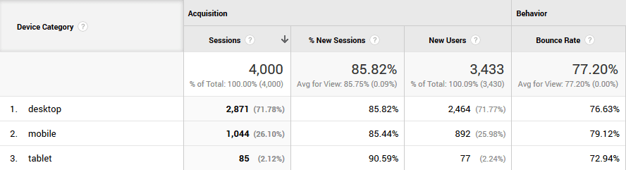
One simple way to gauge whether your site is mobile friendly is to compare the bounce rate between desktop and mobile sessions. Theoretically, if the mobile experience is as good as the desktop experience, your bounce rates should be roughly similar (as they are in the example seen above). If your mobile bounce rate is way above the desktop baseline, you still have work to do on this score.
Fortunately for you, we’ve already shown you how to improve your bounce rate in five simple steps.
5. Use Cross-Device Tracking
Cross-device tracking is a bit more advanced than everything we’ve covered so far, but it still warrants a mention. When we talk about cross-device tracking, we’re referring to the ability to track users across sessions as they use different devices.
It sounds like a lot of work, but this method enables websites to track and target users when they switch from desktop to mobile devices. Not all sites use or need cross-device tracking, but if you’ve ever spent time on a platform that shapes your experience according to your individual interests and on-site browsing behavior, cross-device tracking is likely in play.
Websites can employ cross-device tracking on a small scale to check if visitor behavior changes when they are using different devices. And this is a tactic which you can use to improve your website’s mobile performance.
As we mentioned earlier, this is an advanced technique, but if you’re interested in trying it out for yourself, you can set up cross-device tracking with Google Analytics.
Conclusion
Making sure that your website is ready for mobile traffic can be time-consuming, but the rewards are well worth the effort. Depending on the changes you implement, your search engine rankings might improve, which could lead to an increase in traffic.
If that sounds like something that you might be interested in (and who wouldn’t be?), just put the five steps we discussed earlier into action:
- Check Google’s Mobile Website Speed Testing Tool to see how your site scores on mobile friendliness.
- If you’re using WordPress, check out the Mobile Smart and ShiftNav plugins.
- If you aren’t the DIY sort, hire a professional to make your website responsive, using either Codeable.io or Toptal.
- Use Google Analytics to measure your mobile traffic and bounce rate.
- Consider using cross-device tracking to analyze visitor behavior.
Image credit: Kaboompics.