How to Make Better Use of Typography on Your Website
Typography is often overlooked – when it comes to both design and usability – which is a costly mistake. After all, typographic choices can potentially make or break your site just as much as a bad overall design or poor usability decisions.
While it may seem like a major factor, shrewd typographic decisions can really tie your site’s design together. Consider for example that high-quality font choices can increase readability and enable you to hold the reader’s attention, among other benefits.
In this article, we’ll first explain some of the basic typographical terms you should acquaint yourself with. Then, we’ll dive into the three core actions you should take to improve your site’s typography, showing you exactly how to do so.
The Basic Typography Terms You Should Know
Since we’re going to explore several techniques to improve your website’s typography, it makes sense to introduce you to some basic typographical terms first.
We’re going to make an effort to avoid technical terms and keep things simple, but the information below will definitely come in handy when it comes to picking fonts for your website.
Fonts and Type Families
A lot of people use these two terms interchangeably these days, but there is a subtle difference. In web design, a font is technically a file that generates a set of characters in a typeface, whereas a type family refers to all the variations that retain a similar style (think italic, bold, etc.).
Tracking
Tracking refers to the space between characters. For example, when you justify a paragraph to give its lines a uniform length, you do so by increasing the tracking between letters.
Kerning
Kerning refers to the distances between each letter. It’s typically used to ensure that the space between any two characters is consistent with the spacing of any other pair within a font.
Baseline
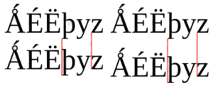
The baseline, quite simply, is the imaginary line upon which your characters sit. Note that ‘descenders’ such as the bottom part of a lowercase ‘p’ extend below the baseline.
Leading
Leading refers to the distances between individual baselines. In other words, it’s the distance between the bottom of each line.
3 Key Ways to Improve Your Website’s Typography
While typography may seem an esoteric subject, following best web practices is relatively straightforward. As long as you follow the below basic practices, you’ll be on sound footing.
1. Pick the Perfect Fonts
When we say that you should pick the ‘perfect’ font, we refer to one that complements the style of your website.
Our blog, for example, deals with technical subjects and in-depth how-tos. A fancy gothic font would definitely go against the aesthetics of the blog, so instead, we went with something clean and legible:
You might be inclined to think that a choice of font doesn’t matter too much as long as it’s legible, but that’d be a mistake. A new font can completely overhaul the ‘feel’ of a website, which should be evident if you’ve ever played around with multiple font styles. There are some big differences at play.
Choosing the ‘perfect’ font for your website will mostly come down to your own tastes, but there are other factors to consider besides style:
- Readability. Your choice of font should be easily readable at both small and large sizes. Take it for a test run in multiple browsers and devices before you settle.
- Compatibility. Most websites employ more than one font. Make sure that your picks look good together; consistency is key to a good typographic experience.
- Creativity. Don’t be afraid to break the mold a little if you find a font that you think works well. The world already has enough websites built using Helvetica – as long as you stay away from Comic Sans, feel free to look around for the right fit.
2. Establish a Visual Hierarchy
When it comes to typography, a visual hierarchy refers to an overarching structure. Consider this article as an example – it’s broken down into several sections separated by subheadings, but not all the subheadings are equal. Some are larger than others, which makes it evident they’re subsections.
Most of the time, we don’t notice visual hierarchies on the web, but it’s safe to say they make the user experience more pleasant. A solid visual hierarchy enables us to ‘scan’ pages and articles more efficiently, and find the information we need faster.
There are, quite simply, no downsides to implementing a logical typographical visual hierarchy. There are several methods you can take advantage of to do so, including:
- Size. This is the simplest way to establish a visual hierarchy. Readers will be drawn to the largest text sizes first, which should be used to denote critical information and new sections.
- Color and Contrast. Differences in color and contrast serve the same purpose and variations in size – they draw the eye towards them. If you’re going to go down this route, make sure to choose complementary colors.
- Texture. When we talk about ‘texture’ in typography, we’re referring to visual variations such as bold and italic typefaces. Both types are still the same font, but their visual differences enable you to differentiate content with ease.
3. Optimize Your Paragraph Measures
This last technique is less flashy than its two predecessors, but no less important.
When it comes to text, you might be surprised to learn there’s an optimal line length to maximize readability. The length of what width is known as a ‘paragraph measure’. Tinkering around with your paragraph measures may seem superfluous, but it can make a big difference.
If your paragraphs are too wide, visitors might lose track of where they begin and end. On the other hand, if your paragraph measure is too narrow, their eyes will have to travel back to the start of the next line too often. Either option renders the reading experience more uncomfortable than it should.
Here’s an example from one of our recent articles showing a visually pleasant paragraph width:

Research has shown us that the ideal paragraph measure rests somewhere between 45 and 90 characters per line. All you have to do is implement that measure into your designs to drastically improve their readability. Here’s an excellent guide that will walk you through the process of editing your HTML and CSS to modify yours.
Conclusion
A lot of people tend to overlook typography in lieu of other seemingly more important design considerations. While that may seem reasonable, it’s definitely a mistake. Shrewd (and consistent) typographical choices go a long way when it comes to rendering your website more attractive and usable.
Best of all, you don’t need to become an expert to follow good practices – just follow our advice and you’ll be on your way to a great typographic experience:
- Pick the right fonts for your site.
- Implement a visual hierarchy.
- Optimize your paragraph measures.


