- Jul 06, 2020
 0
0- by A2 Dev Team
User Experience (UX) is often mentioned as an important factor to consider when designing or optimizing your website. However, it can be difficult to pin down exactly what this term refers to, or how to achieve quality UX.
However, all you really have to do to improve your site’s UX is to look at it from the perspective of your end-users. When you consider features such as navigation, design, and performance through the lens of someone visiting your website for the first time, you can set your site up for success.
In this article, we’ll explain what UX is and why it’s important. Then we’ll cover seven tips you can use to improve yours. Let’s go!
Understanding User Experience (UX) and Why It Matters
UX is a somewhat abstract concept related to web design. It refers to how easy and enjoyable it is for people to use your website, including how relevant and valuable they consider your site’s content and features.
Poor UX can lead to a variety of issues that might prevent your site from succeeding, such as:
- Making it difficult for users to find what they’re looking for, and therefore difficult for them to convert
- Increasing your bounce rate because users don’t know what further action to take once they arrive on your site
- Fewer returning users, as visitors aren’t likely to come back to your site if they find it frustrating to use
On the other hand, improving your site’s UX can have the opposite effects – increased conversions, lowered bounce rate, and more loyal, returning users.
7 Tips to Create a Better User Experience (UX) on Your Website
Since UX covers many different aspects of your website, there are several factors to account for when trying to improve yours. Here are seven tips to help you provide a positive experience for your visitors.
1. Simplify Your Navigation System
Clear, easy-to-locate navigation links are central to your website’s UX. If visitors can’t easily move between pages, they’ll have little choice but to bounce (in other words, leave your site without taking further action).
Generally speaking, your website should have at least one menu. For example, on our site, we have a header menu that includes access to support, our customer login page, and information about our most popular services:

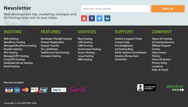
Some sites also include secondary menus, like the one in our footer:

This provides quick access to secondary content such as our blog, more support options, and our affiliate program.
That said, it’s important to keep your navigation simple and easy to understand. You don’t need a link to every single post and page on your site. Prioritize key content such as:
- Your home page
- Your About page
- A way for users to get in touch with you (such as a Contact page or chatbot)
- Post or product categories (depending on the purpose of your site)
Most sites shouldn’t need more than seven items in their main menus.
2. Make Sure Your Website Is Responsive
Mobile web traffic has been on the rise for years now. In this day and age, a responsive website is a must. This means your content should adapt to smaller screen sizes so users can see all your content without having to zoom in or do any extra scrolling.
There are several tools available to help you test your website’s current responsiveness. Platforms such as WordPress and Drupal also include several plugins and other extensions that can help make your online content more mobile friendly.
3. Adhere to Accessibility Best Practices
‘Accessibility’ refers to how easy it is for people with disabilities to use your website. This includes accounting for alternative navigation options (such as keyboard or voice commands), providing captions or transcripts for video and audio content, and much more.
Adhering to accessibility best practices such as those outlined by the World Wide Web Consortium (W3C) will enable visitors who are deaf, blind, or have limited motor skills to still enjoy your site. However, it should also improve your overall UX.
For example, using legible fonts makes content more readable for visually impaired users. However, it also helps those on mobile devices. Likewise, captions enable deaf users to enjoy your video content, but are also useful to those browsing your site in public spaces where they can’t use sound.
4. Increase Your Site’s Speed
Pages that take a long time to load are frustrating, plain and simple. Improving your site’s performance so visitors don’t have to wait around to access the information they need can go a long way to improve your UX.
Some common techniques for speeding up your site include:
- Compressing and resizing your images
- Implementing browser caching
- Setting up a Content Delivery Network (CDN)
Your hosting plan can also significantly impact your loading times. At A2 Hosting, we offer shared hosting plans on our Turbo Servers, which are speed optimized for WordPress, Drupal, and Joomla.
5. Incorporate Adequate White Space
While functionality is integral to UX, design matters, too. How your site looks plays a key role in users’ first impressions of your site, so it’s important to make sure yours comes off as professional and trustworthy.
A clean layout that incorporates plenty of white space can help you achieve this:

Cluttered sites are more difficult to read. They also present more distractions for users, which could negatively impact your conversion rate.
6. Optimize Your Call to Action (CTA)
A CTA is a directive that tells users the next steps they need to take in the conversion process:

The Get Started button in the image above is one example. Others include:
- Buy Now and Add to Cart buttons
- A link to a product or service page where leads can learn more information
- Email list sign up fields
- Directions on how to contact your sales team
Well-designed CTA buttons make it easy for users to understand what they need to do to achieve their goals while on your site. They also streamline navigation.
In addition to using buttons over standard links, it helps make your CTAs stand out with contrasting colors. Their text should be short, direct, and clear.
7. Stick to Web Design Standards
Unique branding and style can help your site stand out from your competition. However, when it comes to certain web design standards, it’s usually better to stick to the status quo. Users have certain expectations for how websites should work. Deviating from them can result in confusion.
Some general guidelines to follow include:
- Having your navigation menu across the top of the page
- Putting your logo on the left side of your header and linking it back to your homepage
- Providing a search bar in your header
- Adding social media links to your footer
- Displaying your primary CTA above the fold so it’s visible without scrolling
Since users already expect these features from your website, they’ll know where to find them and how to use them without having to think about it.
Conclusion
UX covers a wide range of elements on your website, including its overall design, performance, and navigation system. While trying to make sure all your bases are covered may feel overwhelming, it’s within your grasp to provide your visitors with a seamless experience.
Throughout this post, we’ve covered several tips you can use to improve your site’s UX. Navigation is of the utmost importance, as are responsive design and accessibility. It’s also key to attend your page speed and design features such as white space and CTAs.
Image credit: Pexels.


