- Oct 05, 2018
 0
0- by A2 Marketing Team
Websites are not only platforms for you to sell your business. They can also be launchpads to encourage people to get in touch with you. However, if your contact page is dull, hidden, or uninviting, it might scare off customers.
Fortunately, with a few easy steps you can create a contact page that highlights the reasons why your audience should want to get in touch. The ideal contact page is easy to find, draws people in, and tells them everything they need to know.
This article will teach you how to build a contact page that can improve the conversion rate for website visitors who take the time to reach out. Let’s dig in!
What an Outstanding Contact Page Includes
A stellar contact page doesn’t have to be complicated – in fact, the simpler the better. It just needs to help people find the quickest way to get in touch, based on their needs.

The longer customers have to wait for an answer, the more impatient they’ll get. This means they should be able to quickly scan your contact page and find how to get in touch.
Here are the key elements you’ll want to consider when building your contact page:
- Location. Above all else, the contact page needs to be in a visible location. If your visitors can’t find it, nothing else matters.
- Inviting text. Let your visitors know why they should want to contact you. If you’re a service-based company, you might invite them to request a quote, or offer a free consultation.
- A contact form. Contact forms are an easy way for visitors to get your attention without having to leave the website. Plus, you can gather information about who they are and what they’re looking for.
- Your business email. It’s best to also include an email address on your contact page. Some people don’t like filling out contact forms, and just want to get directly in touch.
- A phone number. Phones are useful when clients need a speedy response. If you don’t have one, you can create a dedicated Google Voice number for your business – it’s free, and gives you the option of blocking spammers and viewing voice messages as speech-to-text.
- Social media links. Finally, don’t forget to include links to your social media profiles. Some customers prefer contacting businesses through social media over phone or email. This will also encourage fans to ‘like’ and follow your pages.
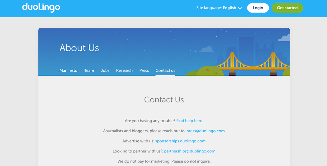
We’ll talk more about how to implement these elements below. First, however, you may want to look through some outstanding contact pages for inspiration. Think about what your own contact page needs are, and how you can use some of the techniques you see in its presentation and layout.
How to Create a Quality Contact Page for Your Website (In 5 Steps)
The good news is that creating a contact page that covers all the necessary bases isn’t difficult. All it requires are the following five steps. Let’s get to work!
Step 1: Include Customer-Focused Copy
Instead of simply listing addresses and phone numbers on your contact page, it’s best to include a little text as well. It doesn’t have to be more than a sentence or two; in fact, you’ll want to aim for brevity. The goal is to make sure visitors understand why they should be contacting you – whether it’s to ask a question, request a quote, report customer service inquiries, or something else entirely.
For example, the TUNE website clearly outlines three ways the company can help customers who get in touch:

This not only offers a clear Call To Action (CTA), it also shows that this business cares deeply about providing service (which is something worth emulating).
Step 2: Provide Multiple Contact Options
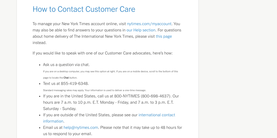
You can’t predict what contact method each customer will prefer – email, phone, a contact form, or social media. Including all four gives everyone the freedom to pick their preferred method:

You can display email addresses and phone numbers as simple text. As for social media links, you can use a dedicated tool for your platform (for example, WordPress offers plenty of social icon widgets). If you’re using a platform without a built-in social icon tool, you may need to manually add HTML button code.
Finally, most platforms will have a tool available for adding a contact form to your site. We’ll go over what this form should look like in the next section.
Step 3: Streamline Your Contact Form
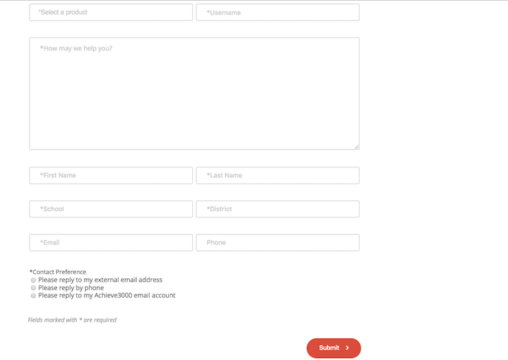
If you have a contact form, it will need to be easy to complete, or many customers may balk. Therefore, it’s best to keep it concise, focused, and well-labeled:

However, don’t make the form overly brief. Various studies have shown that forms with more fields can actually lead to a better conversion rate.
With that in mind, you should still keep required fields to a minimum, so that if something doesn’t apply to a customer, they can leave it blank and move on. Reserve the required fields for information you truly need, such as email addresses and names.
Aside from contact info, your form can include a brief set of important fields. For example, if your business is large, including a drop-down menu for the type of request can help you more quickly sort through inquiries and get them to the right department.
Step 4: Use Mobile-Friendly Design
Once the basics of your contact page are put together, take a look at it on a phone. Is your contact form mobile-friendly?

For example, you’ll want to ensure that the contact button is visible from the mobile menu, and isn’t getting squished beyond recognition. Many businesses combine their contact page with their ‘about’ page to save menu room on mobile devices, which have reduced space to work with.
Your site should also have a responsive mobile menu, so your contact form (and everything else) is easy to access. If you’re using WordPress, you can use the Mobile Menu plugin for help with this. On other platforms, you can quickly build a mobile-friendly menu using responsive CSS.
Step 5: Place Prominent Links to Your Contact Page Throughout Your Website
Finally, it’s vital to consider where you’ll place your contact page. The most common techniques are to include a contact section on your About page, or to add it as a nested drop-down to save menu space.
However, depending on your site’s design, your primary menu might not always be visible. You’ll want to make finding your contact page as easy as possible from anywhere, so it’s important to link to it from multiple prominent locations.
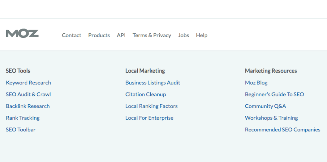
For example, you could put a link to your contact page in the site’s sidebar, footer, or header. These areas stay in the same place even as users navigate to different pages, meaning they’ll never be far from the contact button:

It’s simple to add a link to your sidebar or footer. In WordPress, you can add a ‘text’ widget containing the link. If you’re using another Content Management System (CMS) like Drupal or Joomla, you can use modules instead. For pure HTML sites, you might want to hire a developer for help.
Conclusion
A clear, actionable contact page can help convert your website visitors into requests for more information. Following the advice outlined in this article will help you create a contact page that encourages your audience to actually get in touch.
For best results, these five steps are most vital:
- Include customer-focused copy.
- Provide multiple contact options.
- Streamline your contact form.
- Use mobile-friendly design.
- Place prominent links to your contact form throughout your website.


