Minimalist Website Designs: 5 Outstanding Examples
In the past, it was normal for websites to feature incredibly cluttered designs. People were still experimenting with building websites that contained a huge amount of information, and navigation wasn’t always a top priority. The problem is, a lot of sites still haven’t realized that less is more when it comes to design.
On the plus side, minimalist designs are becoming incredibly popular nowadays. They often look very modern, which is a huge draw, but their main selling point is cleaner pages and simpler navigation. This in turn leads to less time spent on the drawing board when designing your site. Ultimately, it means a better user experience.
In this article, we’re going to talk about why you should consider using a minimalist web design for your next project. Then we’ll introduce you to five of our favorite minimalist web design examples, and talk about how you can implement some of their successful elements. Let’s get to work!
Why You Should Consider a Minimalist Web Design

Most websites pack a lot of elements into every single one of their pages. Take our own blog, for example. It includes primary and secondary navigation menus, a sidebar, the content area, sharing buttons, and more. These are all important elements, and if balanced correctly don’t necessarily lead to a cluttered site.
However, some websites prefer to tackle web design with a ‘less is more’ approach. A minimalist blog might, for example, only include a content area, a simple navigation menu, and perhaps a footer. Both approaches are entirely valid, and minimalist web designs do offer a few advantages over traditional layouts.
Let’s talk about what those benefits are:
- Minimalist sites are easier to navigate. The fewer elements you have on each page, the easier it is for users to find what they want and browse through your site.
- White space can work to your advantage. You can use empty space to make important elements stand out, which may in turn lead to more conversions.
- They’re considered more modern. Minimalist designs are ‘in’ right now, and it’s easy to see why. If done correctly, they can make simple websites look elegant and professional.
The main downside to minimalist designs is that they don’t work as well for complex websites. If you have an online store with dozens of categories and hundreds of products, for example, you should probably make the most out of every nook and cranny in your layout.
On the other hand, websites such as portfolios and blogs are ideal for minimalist designs. They often require you to focus readers’ attention on particular sections or content, which clutter can distract from. The most important consideration, no matter what style you choose, is that your website’s design should take usability into account.
5 Examples of Outstanding Minimalist Web Designs
Instead of just talking about the upsides of minimalism, we think it’s best if you see some real-life examples of this trend in action. Below, we’ll present five of our favorite takes on minimalist web design, and explain what makes them outstanding.
1. Instrument

Instrument is a web design agency with a website that does a great job of reflecting its talents. As soon as the homepage loads, you’ll notice a solid black background with a simple heading on top. The goal is to tell visitors right away what the site is all about. As you scroll down, you get to see some of the agency’s past projects, as well as links to the rest of its website.
Getting your portfolio website right is important. We like this approach, because it doesn’t beat around the bush. As a visitor, you know what the agency is all about as soon as you read the tagline. Plus, you can jump right into their portfolio pieces afterwards.
2. Kickpush

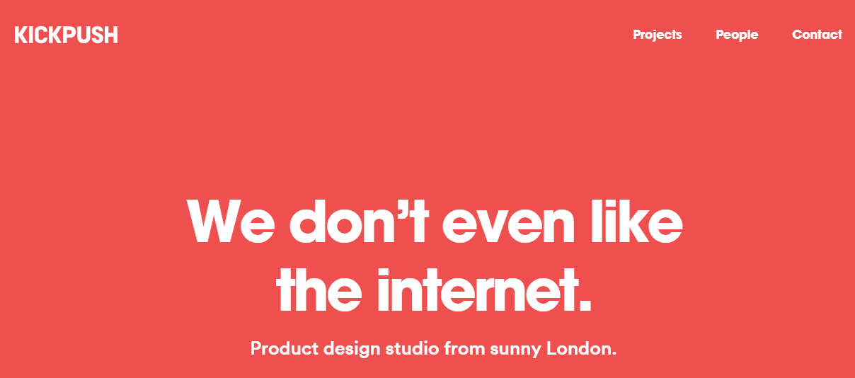
At first glance, Kickpush looks very similar to the Instrument website. In this case, however, we’re dealing with a product design agency. Still, they use the same solid-color background with a large text heading approach.
However, as you scroll down the differences begin to emerge. Whereas our previous pick just included a few portfolio pieces, Kickpush’s homepage offers a lot more sections. The entire website uses the same solid red background, and each section alternates image placement from one side to the other. This simple design technique generates needed contrast, and the bold white lettering in every section is very eye-catching.
3. The Oasis At Grace Bay

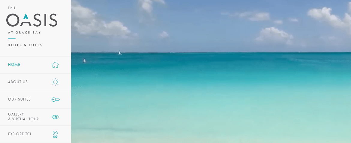
The Oasis At Grace Bay is the website of a paradisiac hotel located in Turks and Caicos. The entire site does a fantastic job of making you feel like you’re already on the beach, thanks to its video backgrounds and the blue, white, and black color palette.
The design here is straightforward – there’s a wide sidebar navigation menu with ample links to help you explore the website. Each page features a simple grid design with lots of white space, so every element stands out. Unlike the previous entries, this website contains a lot of information on each page. However, the excellent use of white space keeps the design clean and uncluttered.
4. KBS Canada

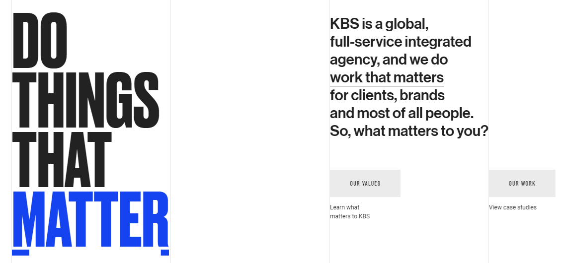
KBS Canada is one branch of a global branding agency, and features one of the most innovative minimalist designs we’ve seen thus far. In this case, the homepage includes a broad range of transition effects as you move between sections. This makes navigating the page more engaging, and is a technique you can implement on any website.
Moreover, KBS Canada’s homepage includes a fantastic side navigation menu that enables you to jump between sections. This makes navigation much more straightforward, particularly for pages that extend a lot vertically.
5. La Constitución Argentina

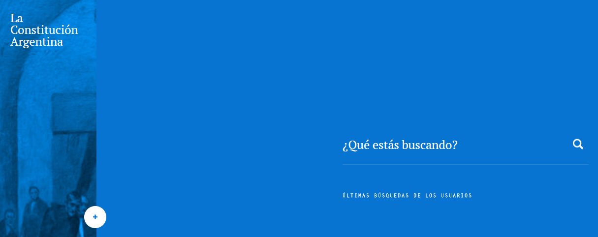
You probably weren’t expecting to see the official page of the Argentinian constitution included in a roundup of minimalist web designs. However, a subject matter as dry as this one requires an exceptional design to make its website enjoyable – and it succeeds.
The core of this website is a stylish search bar that enables you to quickly find the parts of the constitution you’re looking for. Plus, you can jump between chapters using a simple vertical navigation menu. In fact, it’s similar to the one we saw on KBS Canada’s website.
This website also includes a handful of elegant transition effects that imitate flipping a book’s pages. Small animations like these are a great addition to minimalist designs, since they add character to the website but not a lot of content.
Minimalist Website Design Examples Conclusion
Minimalism in web design isn’t just a fad. The style has stuck around because it often makes for more usable websites. The less clutter there is on your pages, the easier it is for users to navigate around and find what they want. Minimalist designs can also look quite elegant without a lot of work, which is great if you’re new at building websites.
The key to an excellent design is to understand that the same techniques don’t work for every project. Depending on what your website is about, you may want to pull inspiration from some of the sites we discussed earlier. For example, Instrument makes excellent use of transition effects, and Kickpush uses contrast masterfully, letting its various elements pop out at you.
Image credit: Pixabay.
