One-Page Website: When To Use Single Page Website?
Most websites contain a lot more information than you might realize. Even the simplest business can end up with a site consisting of several pages, providing contact information, details on its services, and more. In some cases, this multi-page approach works well. However, you’ll often run into situations where a one-page website is a better fit.
The trick lies in knowing when to use each design. For example, one-page sites are perfect for individual portfolios, but not so much if you’re talking about an online store. Understanding when it makes sense to use one page and when you need more space to work with will save you time, and help you create more engaging websites.
In this article, we’re going to break down the differences between one-page and multi-page websites. We’ll also show you some of our favorite one-page designs, and discuss when that approach makes sense. Let’s get to it!
The Difference Between A One-Page Website and Multi-Page Websites
Most websites you’ll visit include multiple pages. Some, like our own website, include dozens of pages. In our case, this is a necessity due to all the services we offer:

This multi-page approach has been the standard for a long time now. However, in some cases, all you need is a single page to showcase all the information your visitors will want. This alternative design is called a ‘one-page website’. Landing pages are a common example of this type of layout:

Packing an entire site onto a single page might sound like a bad idea at first, since it limits your options. However, it can make sense for certain small-scale projects. What’s more, a lot of websites add entirely unnecessary clutter. For example, contact forms are often given their own pages, when they could easily be added to bottom of your home page instead. Likewise, many sites have dedicated About Us pages, even though a few blurbs on the home page might suffice.
Beyond the obvious fact that everything is packed onto a single page, effective one-page sites often share certain characteristics. These include:
- Clearly defined sections. The more information you include on a single page, the more care needs to go into the way it’s formatted.
- Big header elements. These are a mainstay of most designs these days, but they’re even more important on one-page sites, since they help you capture visitors’ attention.
- Custom scrolling effects. One-page websites often rely on custom transition effects to tell stories more engagingly.
With all that in mind, let’s talk about when it makes sense to use a one-page site.
When to Use a Single-Page Website Layout
As you can see, there are some clear pros and cons to using a one-page vs. a multi-page site. Multi-page designs provide you with far more space to include all the information you want. In other words, they can be as flexible as you need them to be. The downside is that multi-page websites can be harder to navigate, and it can be more difficult for visitors to find the information they need.
As for one-page designs, the limited space can make it easier for visitors to find what they’re looking for. It’s also easier for you to keep the focus on the most important information or elements. Plus, you can save a significant amount of time with this type of site, since you only have one page to design and maintain.
Here are a few examples of situations where it makes sense to use a simple one-page layout:
- Portfolios. If you’re a freelancer, a single page is often enough to give potential employers a bit of information about who you are, feature finished projects, and even include a simple contact form.
- Landing pages. This type of website is all about converting users. Limiting yourself to one page enables you to craft a narrative without any distractions, and run A/B tests more efficiently.
- Brochure websites. If your business only needs a simple website with photos, contact information, and an introduction to your services, you don’t need dozens of pages to pull it off.
The sensible approach is to know exactly what you want to include on your website before you start working on a design. Create a rough sketch of your site, and outline of the elements you’ll need and where they should be placed. That way, you’ll easily be able to figure out if the one-page approach is appropriate.
3 Outstanding Examples of One-Page Website Designs
So far, we’ve been discussing one-page websites in the abstract. Now, it’s time to check out some real-life examples of this design philosophy in action. These sites should help to give you some inspiration for your own projects.
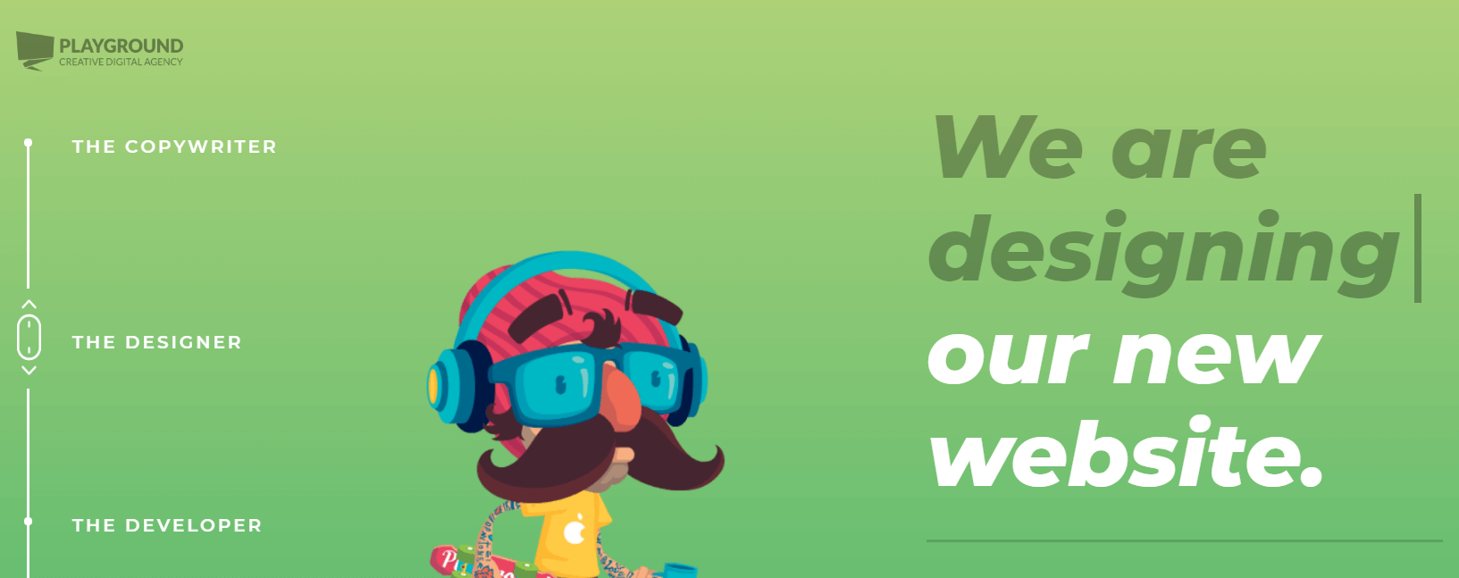
1. Playground Digital Agency

The Playground Digital Agency website is an excellent example of how to pack an entire portfolio onto a single page. Its use of transitions is fantastic, and makes you feel like you’re navigating through an online comic.
Within a single page, you can find out about the agency’s services, team members, past clients, and contact information. The website even includes a fun chatbot you can use to get in touch instead of sending an email, which makes the page feel more interactive.
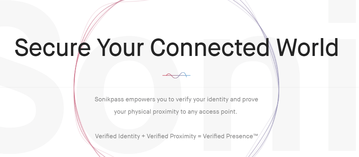
2. Sonikpass

Sonikpass is a sound-based, two-factor authentication device that feels incredibly futuristic. The website is designed to give the same impression. In a nutshell, it’s a landing page designed to drum up excitement for the product. The entire page is meant to explain how the device works as you scroll down.
The design itself is quite simple, with mostly white backgrounds and understated images. However, Sonikpass uses simple animations to liven the page up, and help you understand how it all works. Overall, this website is an excellent example of how to tell a compelling story on a single page.
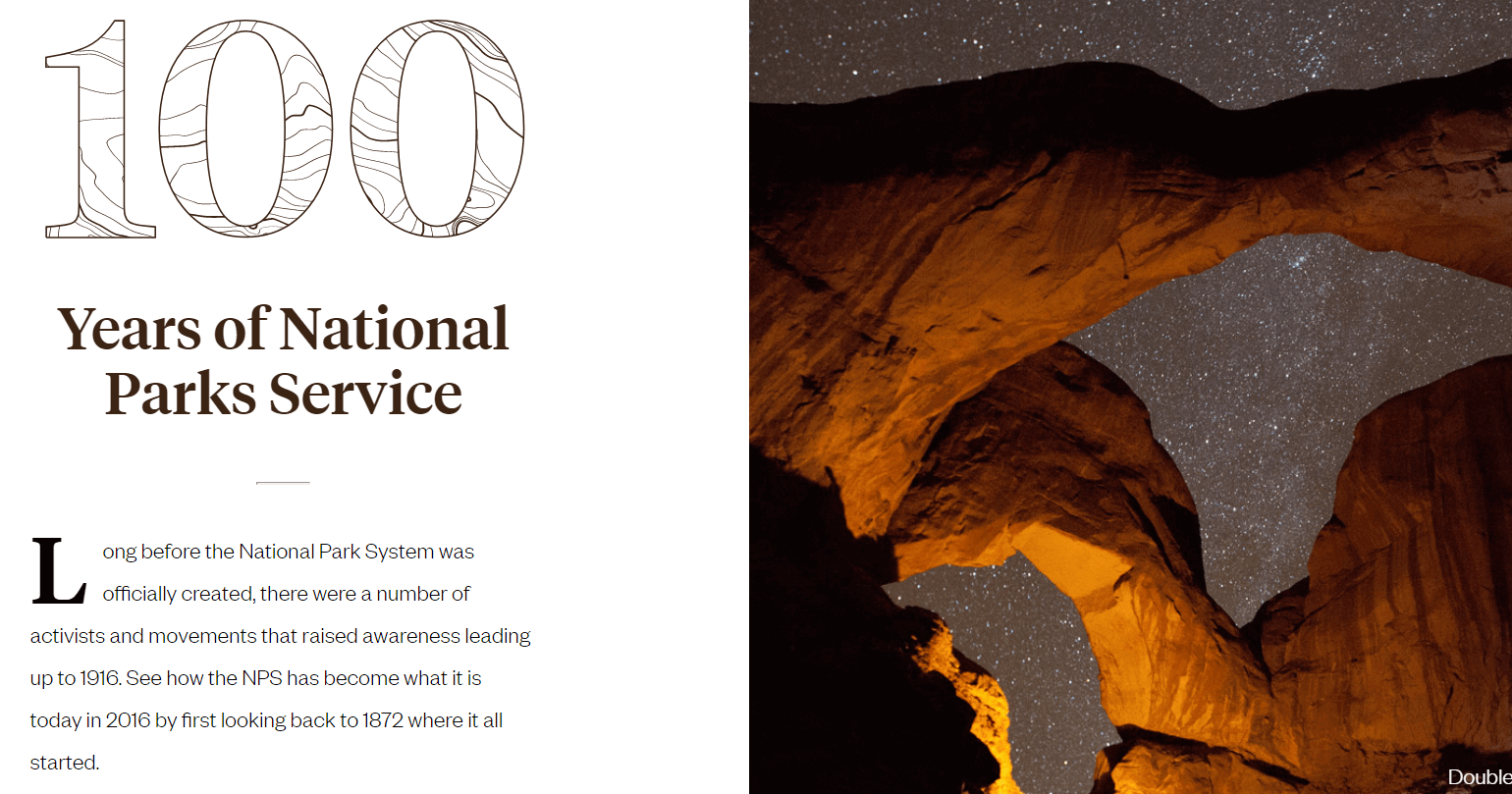
3. 100 Years of National Parks Service

From a technical standpoint, this is the simplest website we’ve looked at. However, the 100 Years of National Parks Service page stands out thanks to its amazing photography and simple layout.
As you scroll down the page, you’ll see an icon to the left that follows your progress, much like a bookmark. At any point, you can jump back and forth to other sections by clicking on their respective icons. This is a simple effect, but it makes navigation feel enjoyable. By the time you get to the end of the page, you’ll probably be ready to make a donation to the National Parks Service.
One-Page Website Conclusion
One-page websites can be incredibly engaging if used correctly. Since there’s less information to sort through, chances are your visitors will pay more attention to your content. That, in turn, can translate to higher engagement and even more conversions.
Not all projects are a good fit for one-page layouts, however. Online stores, for example, almost always require individual product pages. If you’re creating a portfolio or landing page, on the other hand, one page may be all you need. It all comes down to evaluating each project on a case-by-case basis.
Image credit: Pixabay.
