What Is Visual Hierarchy (And How Can You Implement It)?

Every time you visit a new website, some unique element will likely catch your eye. It might be a Call To Action (CTA), a hero header, a logo, or anything else that stands out. In most cases, those elements don’t grab attention due to coincidence, but because they were designed to do so.
Using design fundamentals to ensure that the elements you want will stand out is called ‘visual hierarchy’. If you know what those fundamentals are, you’ll have a much easier time getting visitors to pay attention to the content you want, and possibly to convert as well.
In this article, we’ll dig a bit deeper into what visual hierarchy in web design is and how it works. Then we’ll go over some of the key elements you can use to implement a successful visual hierarchy in your website’s design. Let’s get to it!
What Visual Hierarchy Is
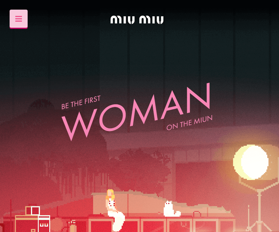
To illustrate what visual hierarchy means, let’s take a quick look at the following home page. We’re willing to bet that the first thing you’ll notice are the splashes of blue around the page, as well as the heading to the left:

Once you take that in, your eyes will probably move to the text on the right, then to the menu above. Finally, you’ll scroll down the page to see the rest of the content.
This home page is a simple, yet excellent example of visual hierarchy done right. In other words, it uses basic design fundamentals to ensure that you’re drawn to the key elements. That’s important because, with a website, you need to grab visitors’ attention right away so that you don’t lose them.
If you want a simpler example of visual hierarchy in action, take a look at one of the most streamlined websites out there:

This site is famous due to its simplicity, yet it still manages to implement a visual hierarchy by playing around with text sizes and weight.
It’s important to understand that visual hierarchy doesn’t require a mastery of web design to implement. All it takes is a basic grasp of design fundamentals and how they interact with each other, which is what we’ll explore in the next section.
5 Elements You Can Use to Implement Visual Hierarchy in Your Designs
There are a lot of ways to use design on your website to catch visitors’ attention and get their eyes where you want them to be. Let’s go over five of the most fundamental techniques.
1. Color
Color is key to any website’s design. In most cases, you’ll choose a color palette with shades that complement each other and fit your style, and use it throughout your entire site.
However, the colors you pick shouldn’t only be based on what you think looks good. To get the most out of your palette, you’ll want to choose colors that provide a nice contrast with each other. That way, you can make important parts of your site pop:

That doesn’t necessarily mean you have to use bright colors, though. Consider the website below, for example, which uses a dark purple background with white text:

This is a simple approach, but when you combine it with oversized text it’s impossible to ignore.
2. Size
The larger an element is, the more likely it is to grab people’s attention – you don’t need to be a web designer to know that. If you take another look at all the examples we’ve shown so far, you’ll notice that they all play around with text sizes, making key headings stand out:

When implementing a visual hierarchy, size is the easiest aspect you can play with. If you want a specific element to pop out, increase its size and it becomes nearly impossible to ignore. Another approach that works well is using contrast in text sizes, so that visitors have no choice but to notice the elements you want them to first:

Be wary about oversizing every element on your website, however. As with other design techniques, the more sparingly you use size to highlight elements, the more impact it’s likely to have.
3. White Space
If you want visitors to notice key aspects of your website, then you need to give them a little room to breathe. Take a look at this next website, for example. It’s a bit too cluttered, which makes taking it all in harder:

E-commerce websites in particular often struggle to use white space properly. No matter what type of site you’re running, you’ll want to give each element a bit of room to itself, which in turn helps visitors notice it. Take this section from the Google online store, for example:
![]()
Here, the phone itself is the focus of the entire page, alongside its name and price. By giving every element enough space, the design looks more elegant and it’s easier to focus on each section.
There will be times when a little clutter on your website is unavoidable. Whenever possible, though, you should use white space to maximize the impact of key elements.
4. Alignment
If you pay attention, you’ll notice that a lot of websites these days use a similar approach within their home pages. They’ll present you with a big hero image, slider, or video, and top it all off with oversized text right in the middle of the page:

Naturally, using quality graphics to reel visitors in works. However, you also need to pay attention to the alignment of the accompanying text. By centering it, you ensure that visitors won’t be able to miss it. Placing text to the left also works, since that’s the part of the page that gets the most attention:

Keep in mind – using center or left alignment for your hero text isn’t a rule set in stone. As always, you need to consider what works best for whatever design you’re working on.
Likewise, playing around with different alignments throughout your website can make for a nice contrast, and draw visitors’ attention.
5. Typography
The fonts you use on your website matter a lot. Some fonts are easier to read than others, and your choices can say a lot about your site’s intended purpose. Even using a different font for a few specific elements can be a great way to make those parts of your website stand out:
When it comes to typography, you want to make sure that whichever font you use is easy to read. Usability beats ‘cool-looking’ fonts each time, and if visitors have to squint to make out what you’re trying to say, they’re not going to be happy with the experience:

In most cases, you’ll want to stick to a modest number of fonts throughout your website’s design. Too many different typefaces can make for a very disjointed style, so try to pick options that work well together.
Conclusion
Usually, you’ll want visitors to focus on very specific sections of your website. CTAs are essential to driving conversions, for example, so you’ll want to make sure they stand out from the rest of your content. If you’re familiar with design fundamentals, you can accomplish this by creating a visual hierarchy.
There are a lot of elements you can use to construct a successful visual hierarchy, including:
- Color
- Size
- White space
- Alignment
- Typography
Image credit: Pixabay.